Logos are how companies express their identity. Brands approach logo design with varying types of methods where some methods are tried and tested. Other methods are more outside the box and we can’t wait to see brands come up with using these techniques. We’ve collated our top ten logo design trends based on what we saw on the rise 2019.
Simplification
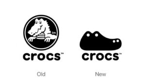
Minimalism has been a trend on the rise over the past few years thanks to people like Mary Quan and trends like Hygge. Brands are now adapting this minimalistic approach to their logos to create clear image using elements white space. In using a minimalistic logo, it’s view-ability transfers better across devices and platforms.
Original geometry
Geometry has been one of the commonly used approaches to logo design, but 2020 will see a little bit more love for the favourited approach. With mosaic designs becoming more popular, it is no surprise that Geometry has become more popular.
Unusual fonts
Typography is another main staple. If you get your lettering right, you are off to a good start. 2020 will see businesses using a more unusual approach this year however. Customers are looking for something different, something a little bit more aesthetically pleasing.
Gradients
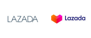
For those not afraid of colour, gradients will be the approach in 2020. Gradients have been a staple in design since design ever existed. There was also a resurgence of neon hues in 2019 across the board and this trend will continue building in 2020. Pairing gradients with neon hues is a sure fire way to have your logo stand out from the competition in 2020.
Cluttered design
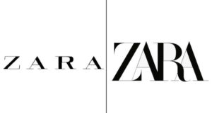
Sometimes, less is more. In this case, more is more. We’ve seen more and more logos recently where elements have been layered on top of each other or pushed right together to create a really full looking logo. The key to getting this technique right to constantly make sure your logo is easy to percieve, if you can’t see the message you’re trying to convey – it’s too full.
Chaotic arrangement
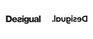
There are some brands who are really pushing the boundries of logo design and using their elements to create a disjointed but whole looking logo. Sometimes being asymmetrical can be a lot more effective than being symmetrical. This approach when excecuted correctly, is a surefire to capture the audience’s attention.
Geometric letters

There should never be a choice between geometry and text. This is another outside of the box approach where brands have being using geometric forms to create a powerful design.
Emblems
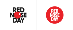
Emblems will begin to shed their text heavy design and shift more towards the minimalistic approach. This will be because brands are going to want their logos to stand out more from the competition as people are browsing more on their mobile than ever before.
Scaling
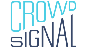
As we have explained earlier, visibility is a huge focus brands will have to have as markets are becoming more saturated as time goes on. Scaling is a solid way of keeping a minimalistic design but still giving your logo volume. Playing with differentiations is a fantastic way of directing the viewer on where to look on their screen.
Text destruction
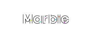
Text destruction is a brilliant way of utilising the white space as you can play with cropping the tops, bottoms and sides of letters to create a sharp edge to your design. You can have your letters/elements fade to create a more relaxed feel to your logo.
Did you have any logos in mind when reading this article? Tell us about them on our Facebook, Twitter, Instagram and LinkedIn.